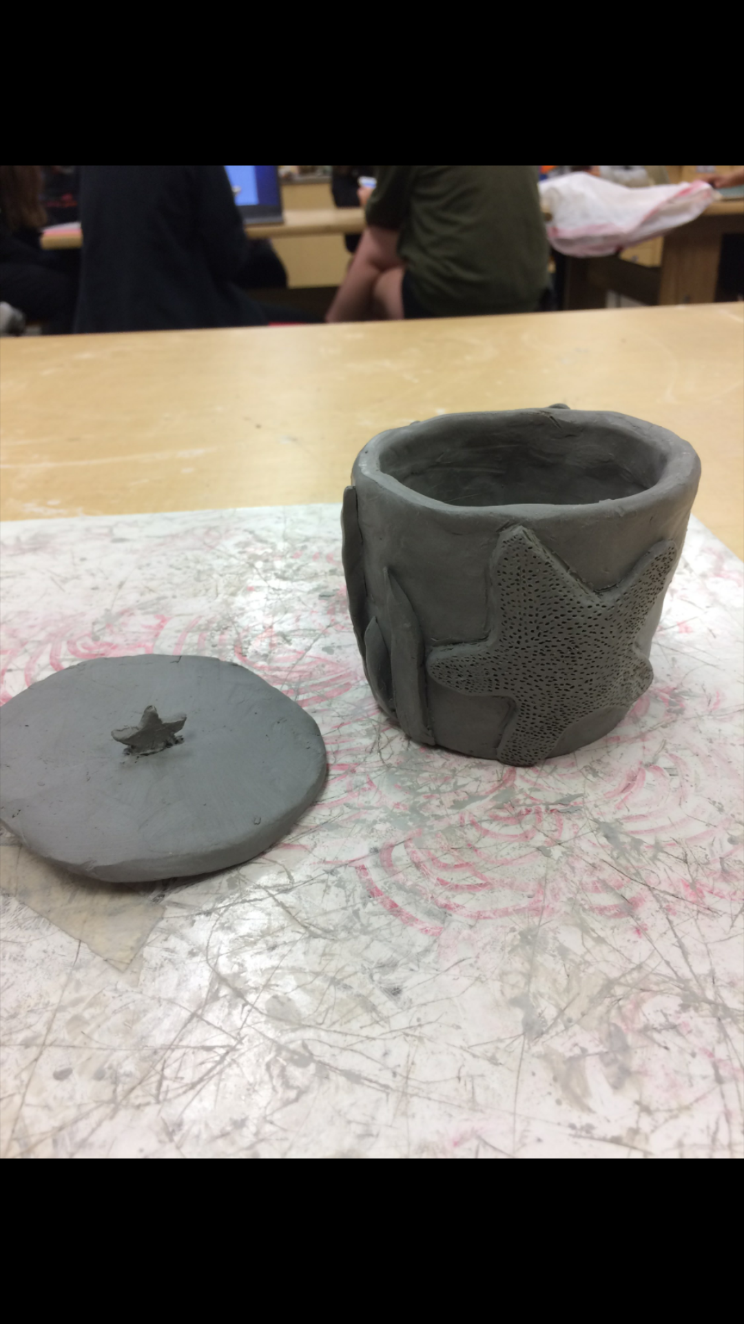
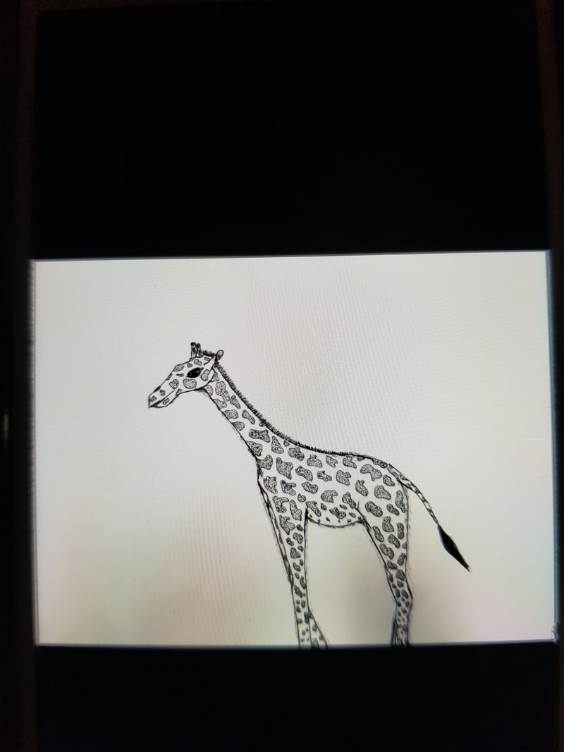
 What I plan to do with this piece is smooth out the rough parts and get the star on the top fixed better. The way I play to finish this piece is by continuing my plan and getting the coil to look better. I also want to add more sea creatures etc on it.
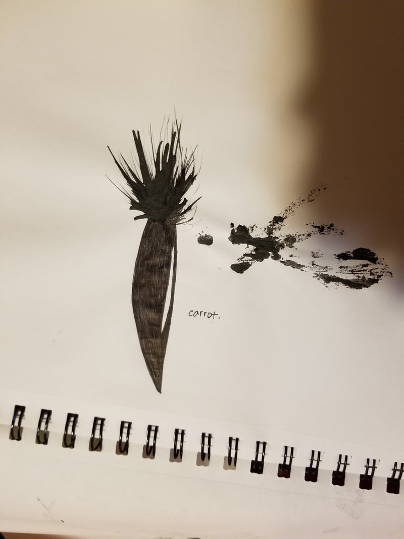
The things I found difficult so far was continuing the coil and blending it. The clay would dry easily so sometimes it wouldn't stick together and the coil would just break. What I found successful so far was that I made the starfish pretty well and it wasnt very difficult for me. My progress up to this point has been going well and I finished what I wanted to and got most done. The slip really helped keep my piece together and not break off.My bisque is happily going the way I wanted it to so that is also a big relief. Even though my piece was mostly coil, I did add some slab around the sunken parts or the parts I couldn't smooth to equally match what I had in mind.
0 Comments
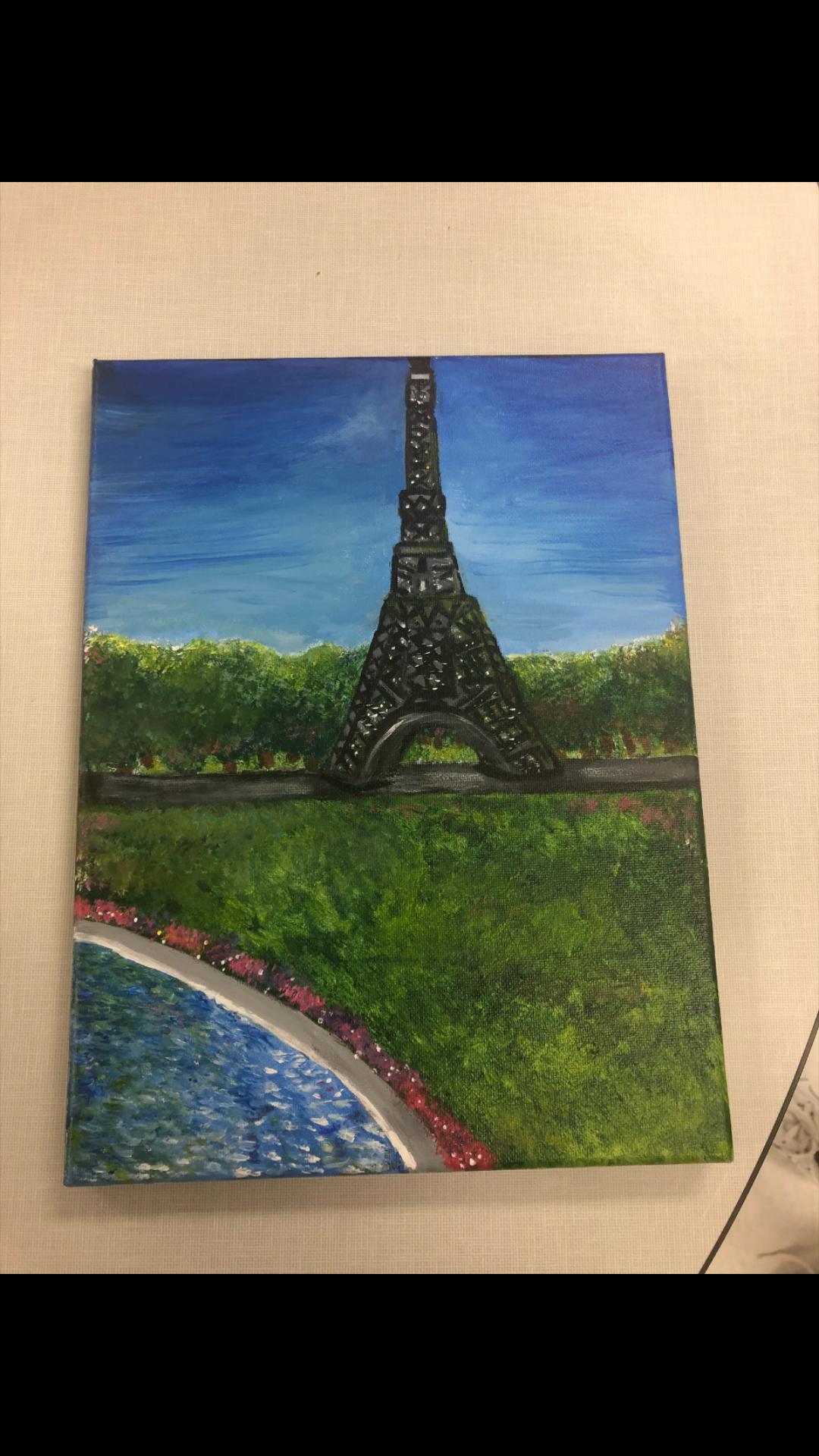 Helpful Painting Warmup The most helpful painting warm up would be the sphere. When i did the sphere I really got to understand how to paint more realistically. So it was definitely very helpful. I used the techniques in the painting sphere in my painting, like where the darkness is and where the light hits the objects. Place Represented The place represented in my painting is Paris France, I went there this summer and visited my family and went around the eiffel tower. Whats important about this place is that its one of my favorite cities ever. Also I have some family living there. Difficulty What i found most difficult in the picture I choose was that it was very hard to make the eiffel tower realistic because of all the detail and little designs on it. Also it was hard to make the tower look far away because I was focusing on the grass and water and sky mostly. Most Successful What I found to be the most successful in my piece was the water and trees. I added different colors and textures to the water and trees to shape the whole piece together and make them specifically stand out to make the whole painting look better and more realistic. My Process In the beginning of my painting I was really concerned because I didn't think it was going to work out at all. The sky was already looking very strange so i didn't think it would look good. But then I remembered that a painting is always ugly before it looks good. So I was patient and just followed my picture and finally after a long 3 days of painting, the piece was finally done and I was happy with the results but I knew that it could be better. Overall I was glad how it turned out. 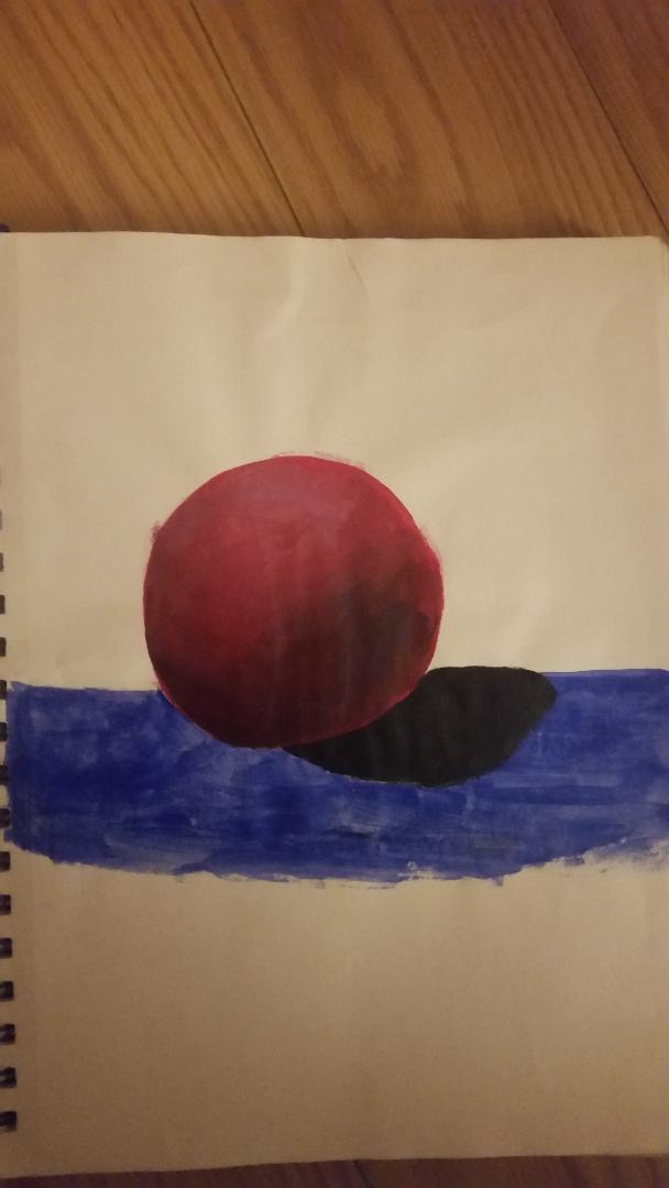 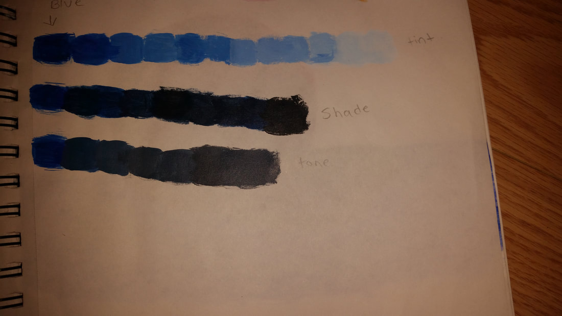 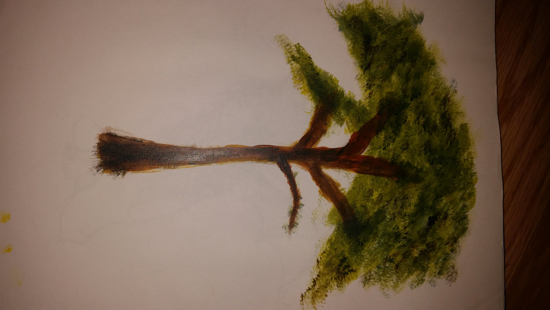 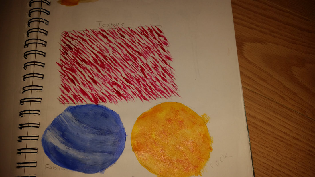 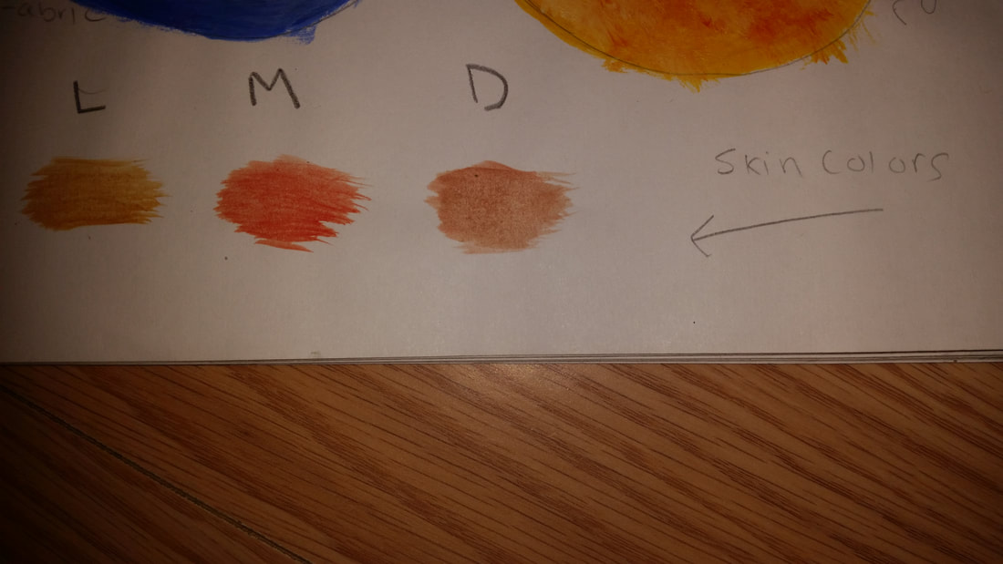 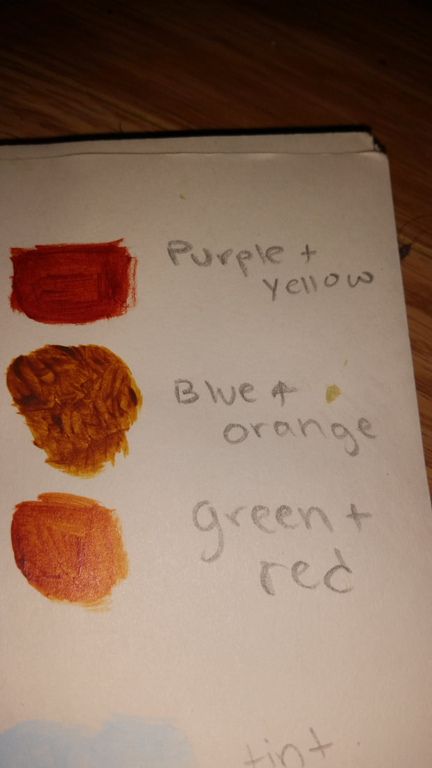 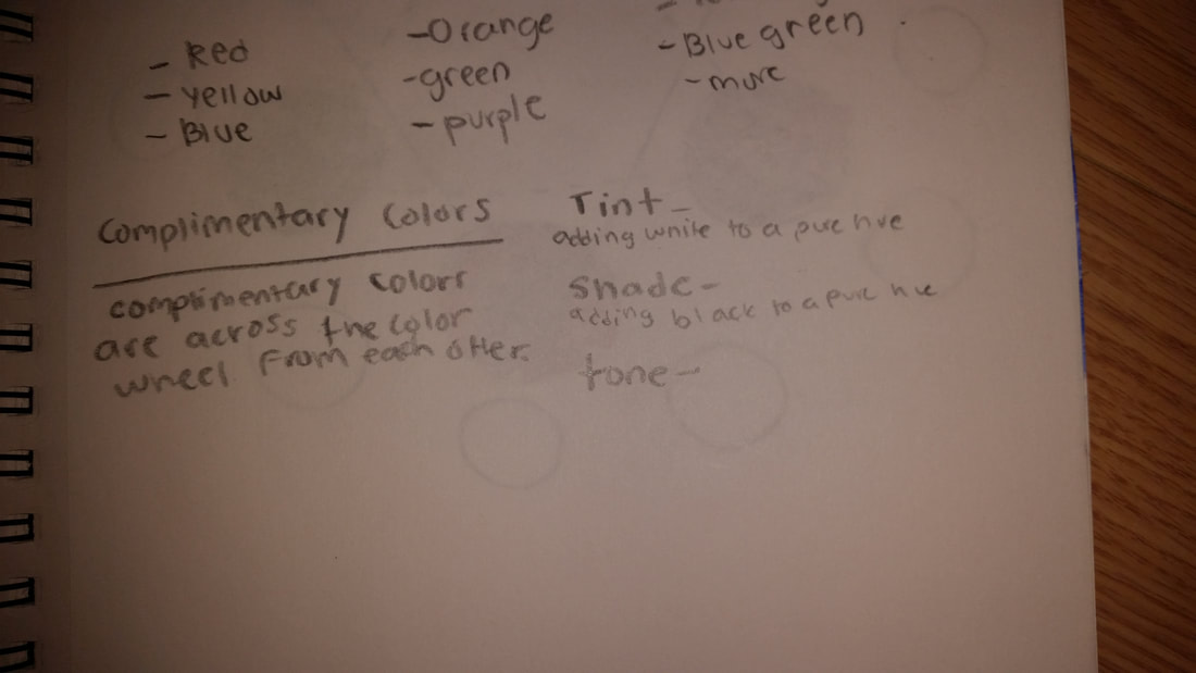 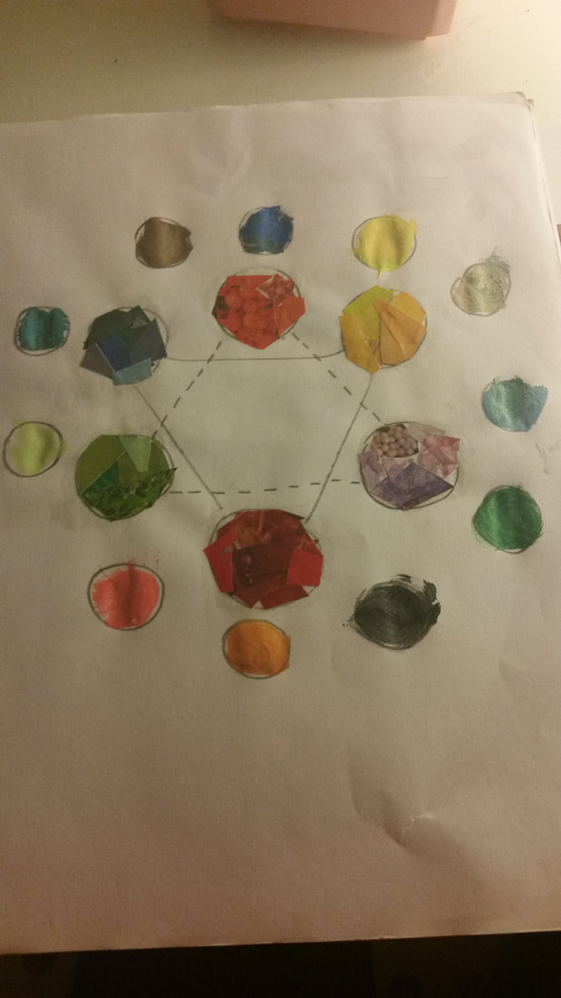 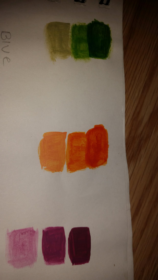 My art mentor is Mark Wheeler. The type of art he designs is the experience of interaction and interference, mostly on Microsoft. Basically what that is , is simple designs on a computer that are interacting to make one whole design. Here is his digital portfolio link---https://www.bestfolios.com/portfolio/markwheeler I think I will benifit from this because his art work is easy to understand and I really get it. What I want out of this is to be able to better understand how online art works and mabye even learn it. 1. What I learned from these activities was how to control my intensity with the pencil or paintbrush and also how to make my own colors and lighten or darken them. I also learned to focus a lot more on detail then just trying to guess the placement.
2.I think defiantly the color wheel because now I know how to make specific colors when I need to when im painting and not have to spend money on different paints 😂. 3.The one I learned the most from was the textures I think. Because if I ever had to paint rocks or water I could use those techniques to make it look more realistic. It was successful because I was happy with how it turned out. 4.Some ways to make brown are green and red, orange and blue and purple and yellow. 5. The way you tone down a color is by using white. For an example if you have a blue and its to dark, you can use white to make it lighter and tone it down. For me the most helpful warm up was definitely the upside down picasso drawing. This was the most helpful for me because I really learned how to focus on shapes more and really looking at the drawing rather then just do value. I also learned how to make the drawing look realistic with all the little details that we focused on in this warm up. And the best thing was that it was challenging because it was upside down, so we had to rely on the shapes to make the drawing and trust that we do good rather than just draw. Pen Drawing Pros - Wasn't messy like the charcoal - It was easy to use (light not hard to use) - Was darker then pencil so it looked more defined Cons - There wasn't a way I could erase if I made a mistake. - The stippling took a while Pencil Drawing Pros -If I messed up I could erase it easily and fix my mistake - I could shade a lot better and make value better - I was able to draw better without accidently smudging. Cons - I had to sharpen my pencil regularly so it took me a while to finish because I held my pencil to hard (was really annoying 😂) -When I was smudging I would sometimes do it to much and it would leave a dark mark. Charcol Drawing Pros - Was really easy to blend - Looked most realistic out of all drawings - I could erase with my hand Cons - I had a lot of white empty circles on the edges from my hands accidentally erasing. - It took a while because the charcoal was messy. - This was my first time using charcoal so it was new for me and I was confused at first. Composition- The nature of something's ingredients or constituents; the way in which a whole or mixture is made up.
Value- The relative lightness or darkness of a color. It is an important tool for the artist in the way that it defines form and creates spatial illusions. 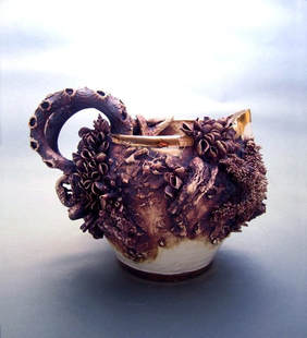 Mary Omalley , is a visual artist who recently graduated from Philadelphia university of the Arts. For the last few years her work has been focused on delicate porcelain dinnerware, including teapots , saucers and pitchers. In her art work she adds starfish, barnacles, sea like objects around the dinnerware to create a masterpiece. "I feel like i'm constantly walking the edge of disaster in creating these pieces." She says this to express how she feels when shes creating these gorgeous pieces of art. Omalley works in a barn on her parents property where she grew up in Long Island. Mary has already started to make a name for herself in craft circles with appearances at events such as Craft Americas Juried shows in Washington DC and Palm Beach. 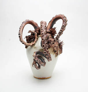 Mary Omalley has a website --- https://www.maryomalley.co.uk/ What makes Omalleys work so inspiring to me is that she uses sea creatures and sea objects in her work and I love going to the beach and the ocean is so fascinating to me so having a delicate structure with ocean creatures and objects is really amazing art work and I really love the outcome. What really draws me in is how the starfish and octopus arms come out of the vase and tea pots. It almost looks like titanic artifacts. I also really love the color contrast of white vase and purple creature parts. It reminds me of the little mermaid so much and that was my favorite childhood movie of all time. What also draws me in is how much I can relate to the artwork, it even almost looks like its treasure from the ocean.
|
AuthorWrite something about yourself. No need to be fancy, just an overview. Archives
October 2020
Categories |

 RSS Feed
